Roles
Art Direction and Production
Art Direction and Production
Project Goals
Branding and Product Packaging
Branding and Product Packaging
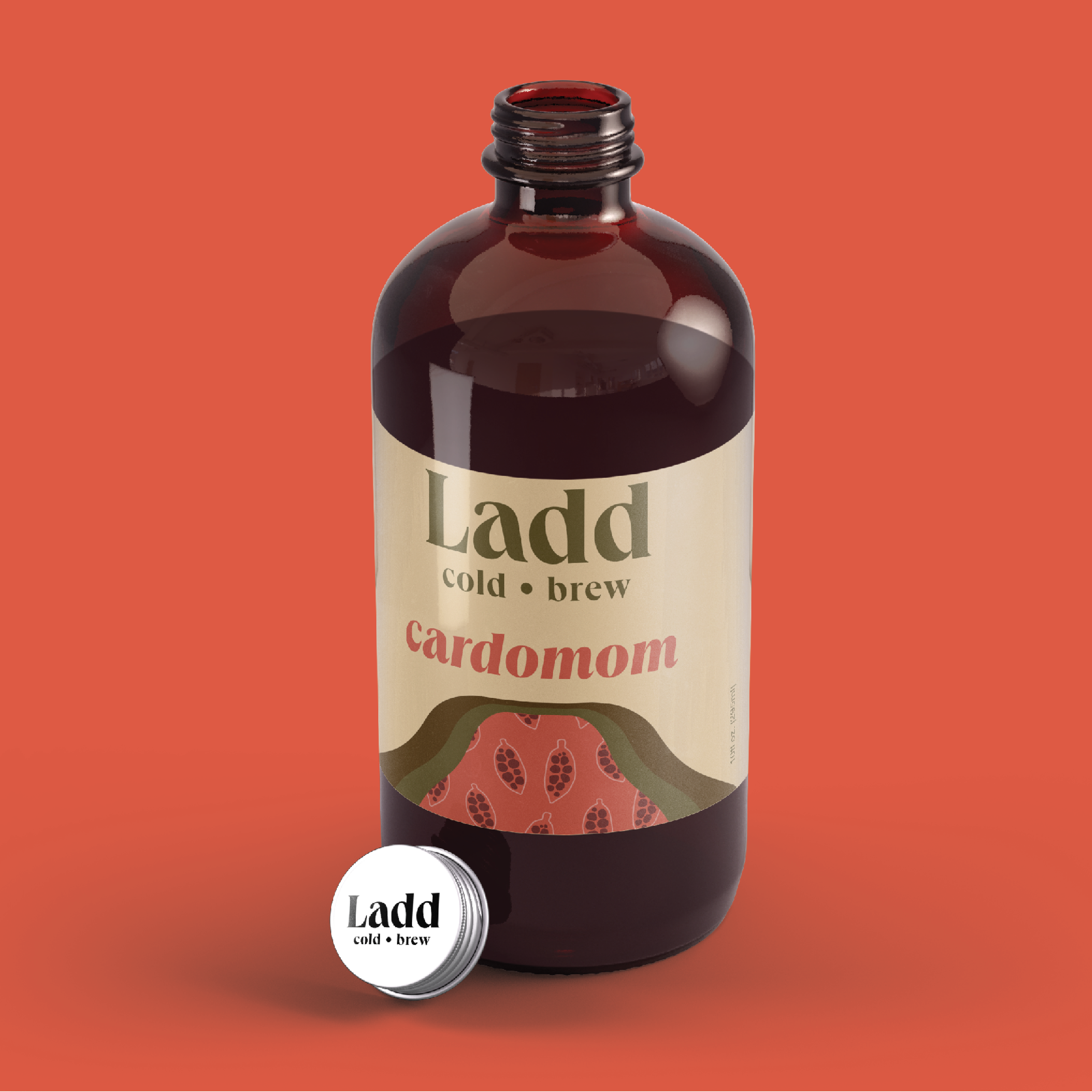
Ladd Cold Brew is a project primarily focused on packaging and branding.

Meant for the young professional on-the-go as well as the coffee connoisseur looking for quality and flavor innovation, Ladd Cold Brew is meant to attract the typical Portlander making quick caffeination decisions. Warm, earthy neutrals and thematic colors that coincide with the flavor infusions of each drink lend the brand a comforting and nostalgic aesthetic. Queens typeface’s dramatic thick to thin strokes brings together the quintessentially Portland appreciation for the old and the new.
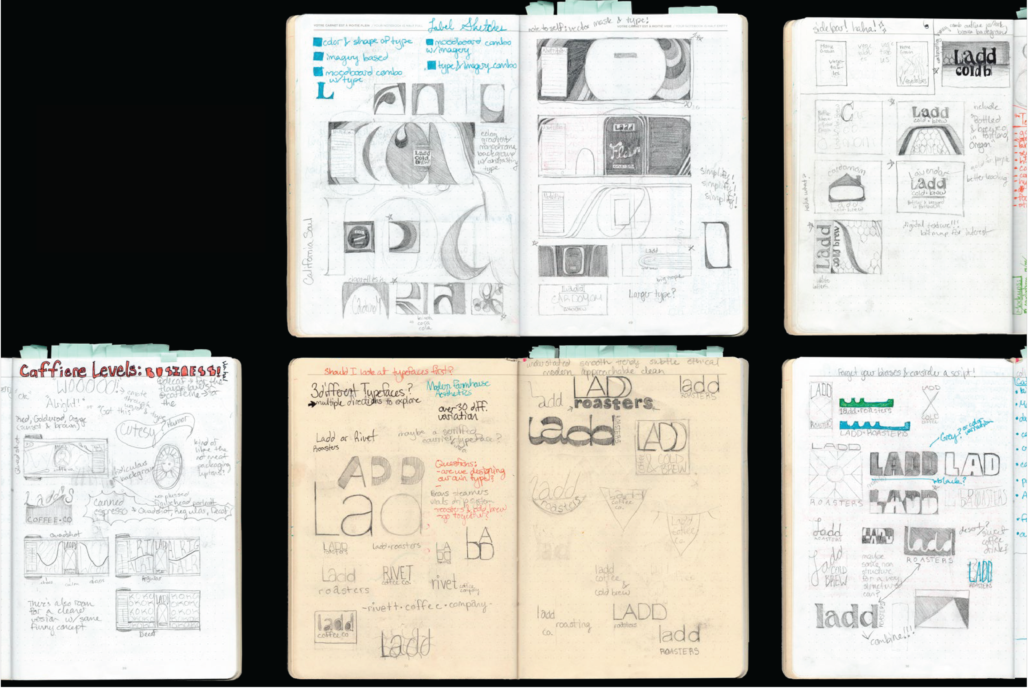
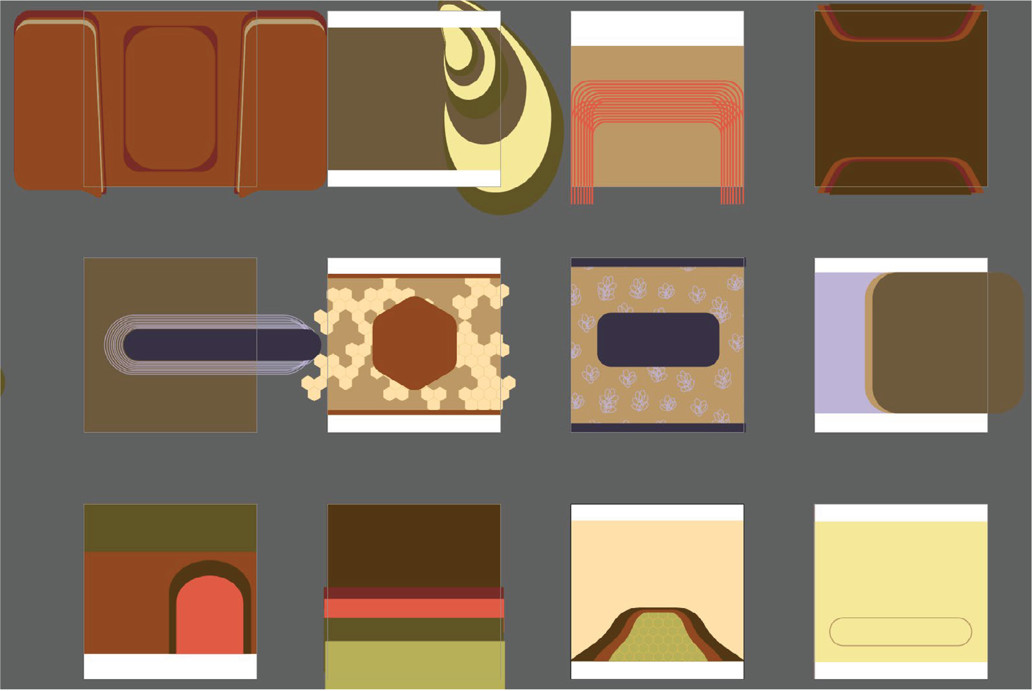
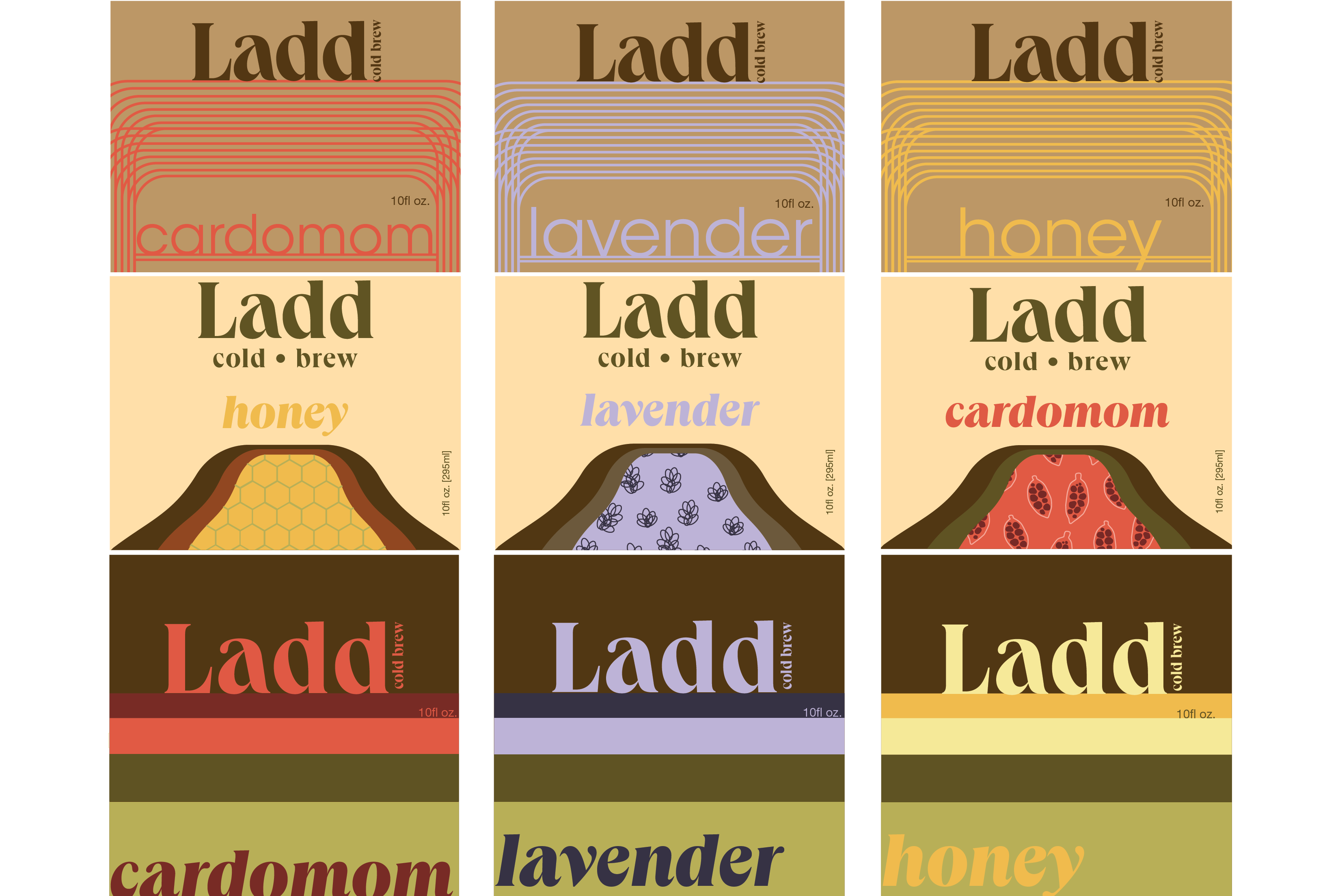
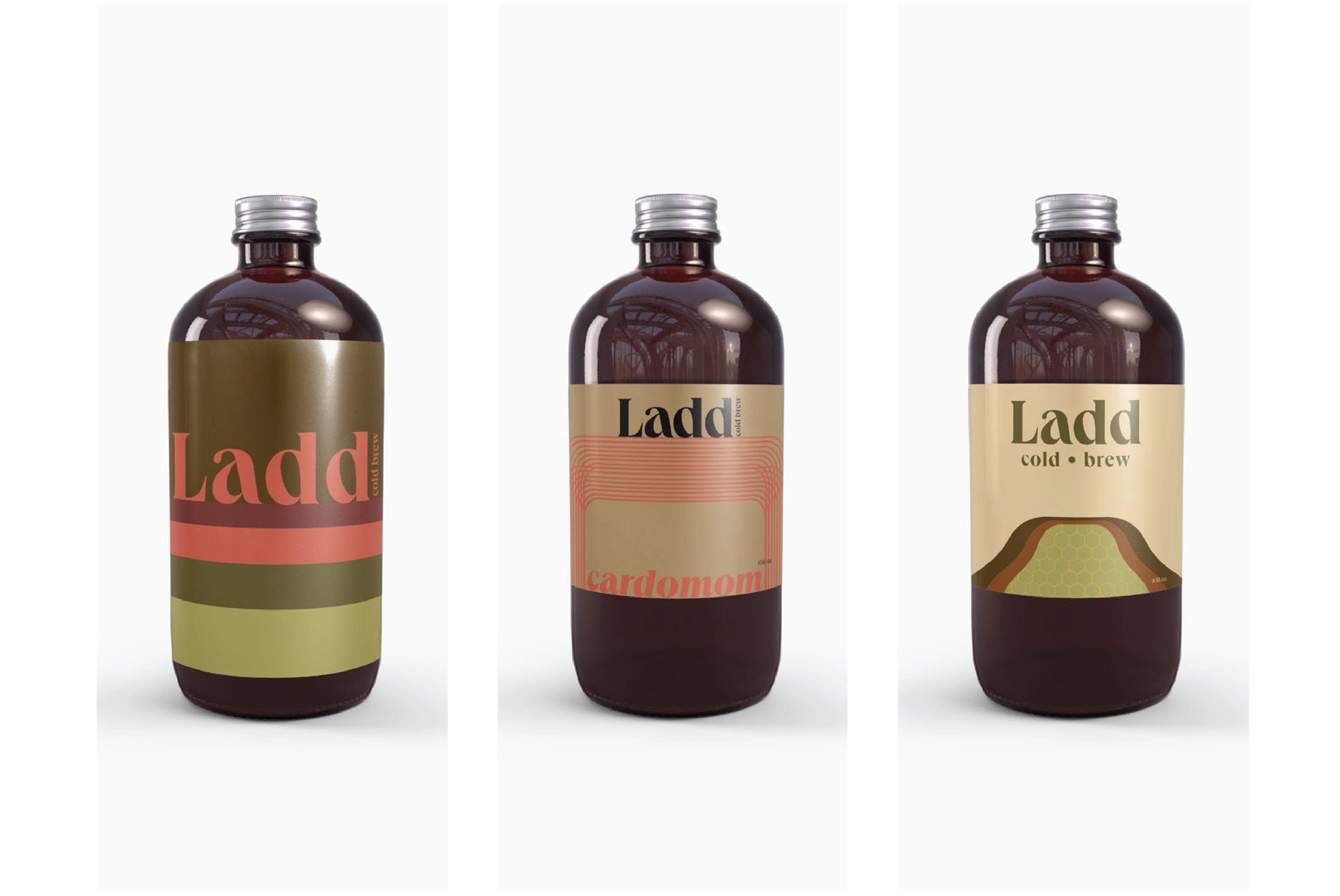
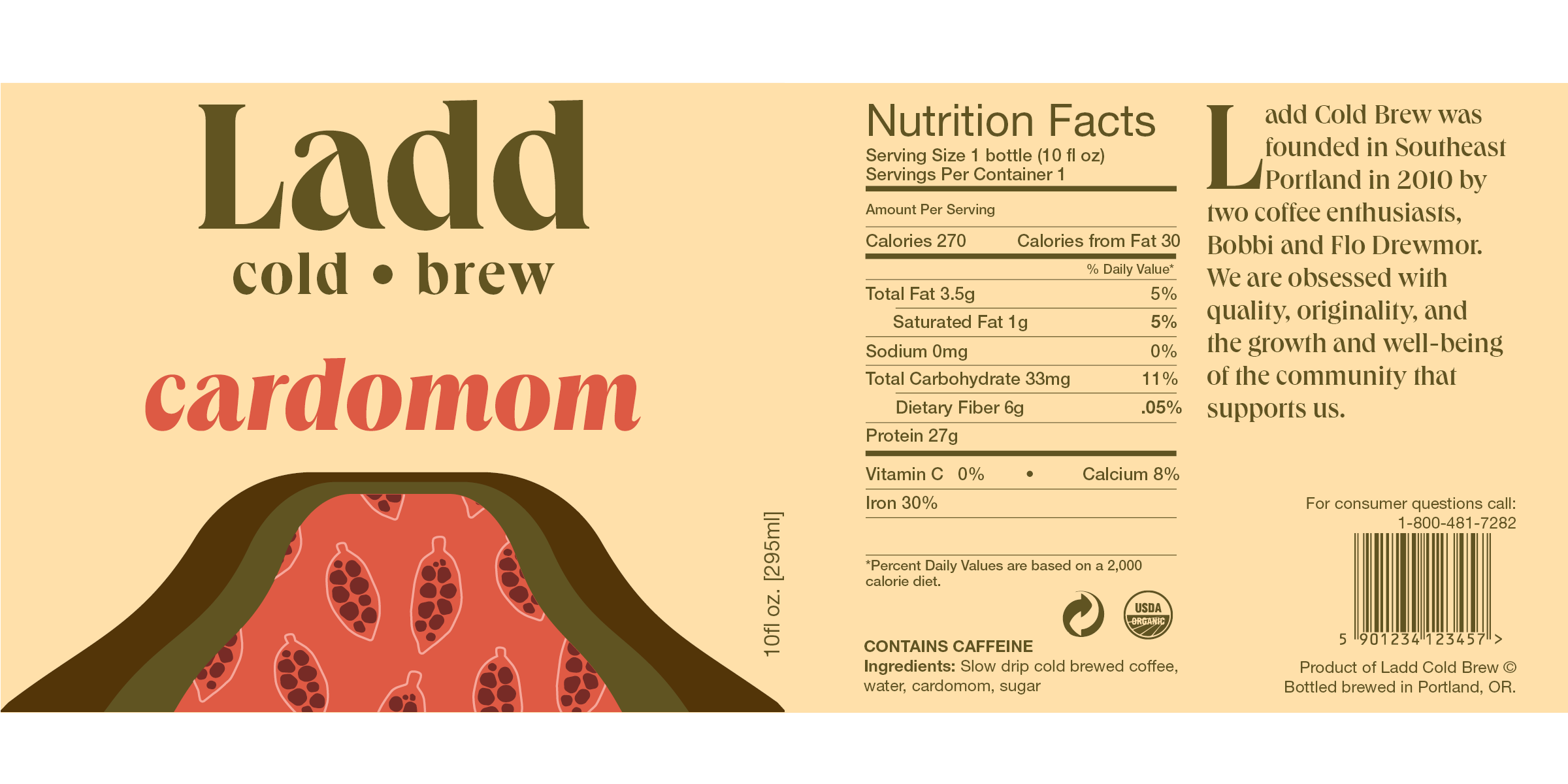
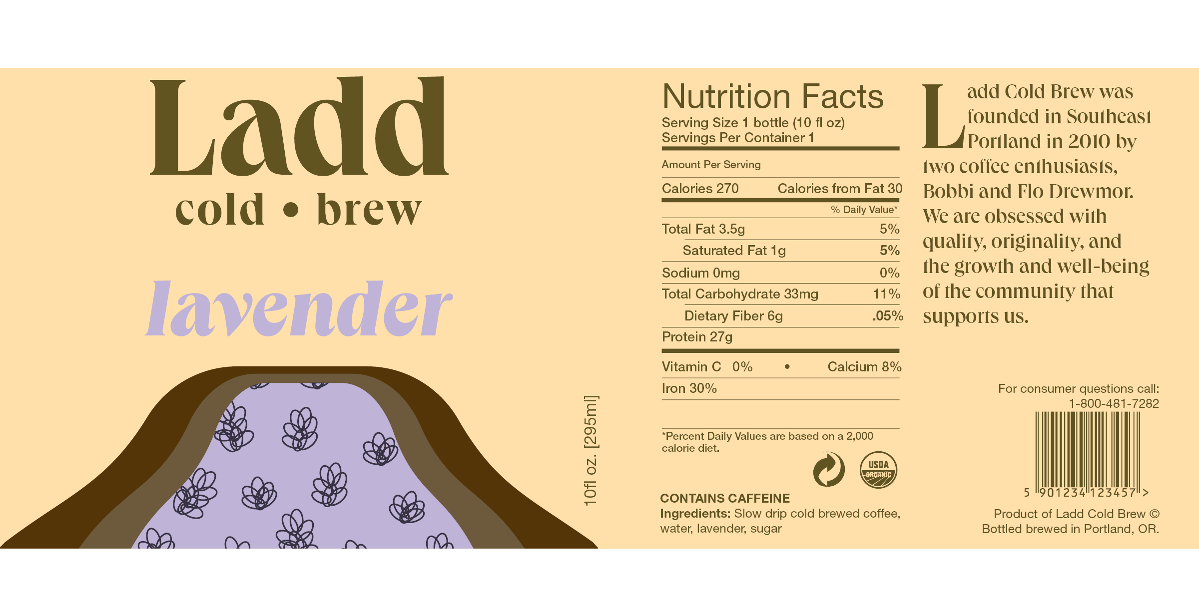
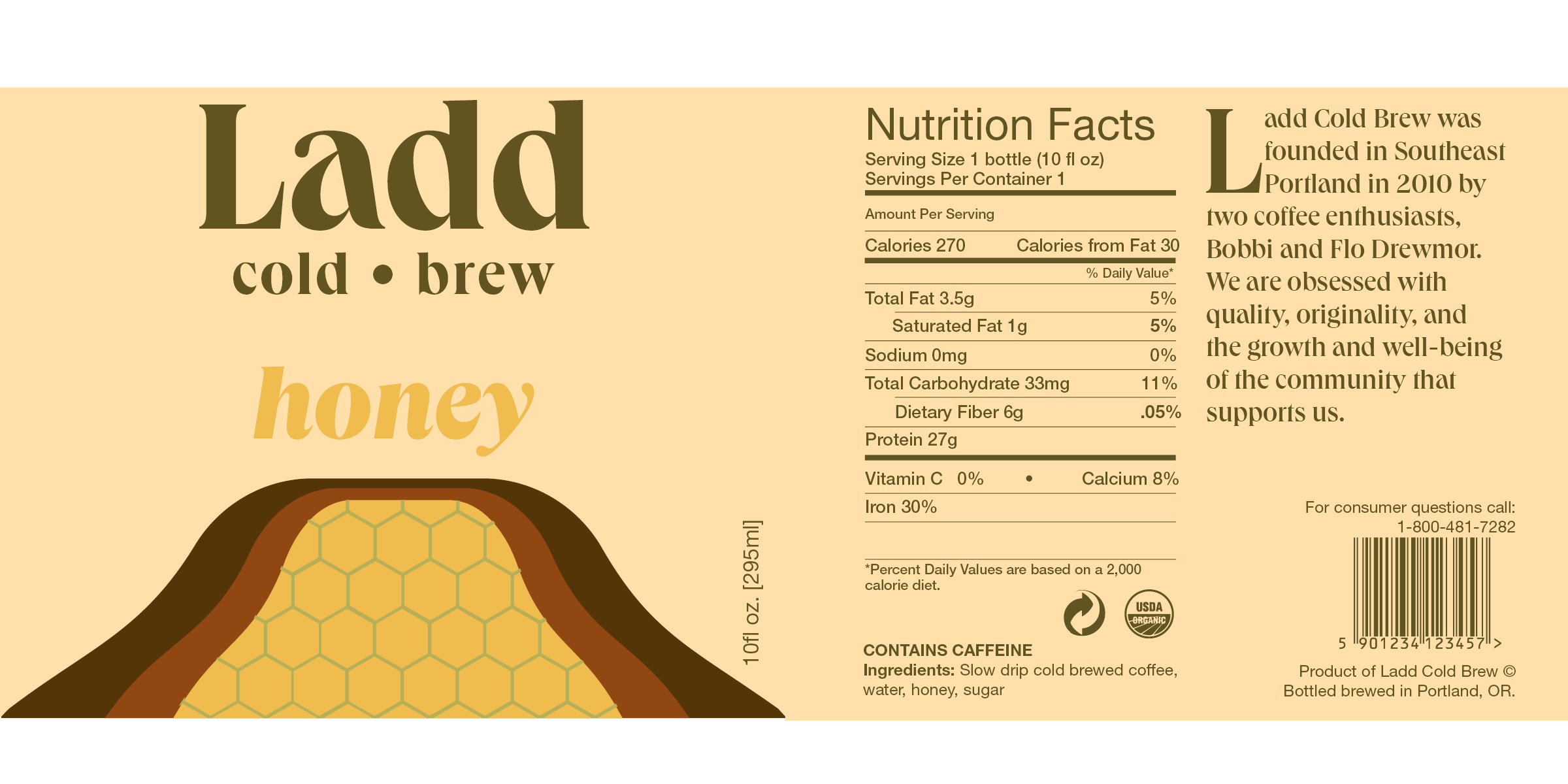
The tone of this coffee is classic, comforting and young. The color palette is largely warm neutrals with a pop of the flavor infusions color. I did this to make sure the Brand would be instantly recognized as a coffee and upon closer observation you would see that they each have a subtle twist. I wanted to pursue a design that would be attractive to the young professionals and freelancers of the pacific northwest. Often although inadvertently we tie our identities to what we buy, so buying Ladd Cold Brew signifies a strong tie to the Portland community as well as an appreciation for the merging of the past and the present.
The culmination of Ladd Cold Brew’s brand identity was borne from a Motown playlist featuring artists such as Curtis Mayfield and Diana Ross (the Supremes days), and the neighborhood of Ladd’s Addition, located in Southeast Portland. I wanted the brand to evoke the same feelings you would get by strolling through the furniture store Lounge Lizard on Hawthorne, and staring at mid-century modern couches and aqua 1980’s vanities. Modern amenities with a nostalgic note.
