Cyber Acoustics Brand Guidelines
Unifying brand identity across marketing, sales, and partner channels
I created a scalable Branding Guidelines and Visual Identity system for Cyber Acoustics, defining how the brand shows up across web, ecommerce, sales, print, and partner channels.
ROLES
Art Direction, Graphic Design
TEAM
Strategy & Content Review
TOOLS
Figma, InDesign, Illustrator, Photoshop, Google Docs
GOALS
Create a scalable system for consistent, on-brand materials across teams and channels.

Overview
Creating a Practical Brand System
Cyber Acoustics needed a clearer way to present the brand across a growing mix of web, ecommerce, sales, print, and partner materials. I created the company’s branding guidelines and visual identity system, defining typography, color, logo usage, image treatment, and photography direction.
The result was a practical framework that helped internal teams and channel partners create on-brand materials with less one-off design direction.

To open the guidelines, I used the logo evolution page as a storytelling moment, showing how Cyber Acoustics’ identity has shifted over time and where the refreshed system fits within that history.

Brand pillars clarified how the identity should flex across education, BPO, and office audiences.
Constraints
A Growing Brand Gap
As Cyber Acoustics’ materials expanded across the website, Amazon storefront, sales collateral, presentations, and partner channels, inconsistencies in image treatment, logo usage, typography, and tone became harder to manage.
The brand needed a scalable system that could keep teams aligned without requiring design direction for every individual asset.

Co-branding rules defined when Cyber Acoustics should lead and how partner marks should appear.

Do/don’t examples turned brand rules into practical direction for partner marketing, presentations, and promotional assets.
Brand Foundation
Expanding the Brand's Foundation
I built on Cyber Acoustics’ existing logo, typeface, and core brand color to expand the identity into a more complete visual system. This included defining supporting colors, image treatment, visual asset usage, and tonal direction for future brand materials.

I translated a simple logo artboard into clear rules for primary, secondary, and overlay use.
Strategy
Systemizing the Brand in Practice
I approached the guidelines as both a visual identity system and an operational tool. The goal was not just to document how the brand should look, but to define repeatable rules for how Cyber Acoustics should show up across digital, print, ecommerce, and sales contexts.

Typography guidance standardized weights, usage, and accessibility rules for marketing and sales materials.

The expanded palette gave the brand more flexibility while keeping future assets tied to the core identity.
Because I was the sole designer on a small team, I built the system while applying it to live projects, including the Amazon storefront, website updates, sales collateral, and partner-facing materials. This helped the guidelines grow out of real production needs instead of becoming a theoretical brand document.
Outcomes
A Design Language Adopted Across Teams
The branding guidelines and visual identity I created both unified Cyber Acoustics's existing market presence and created a system for future expansion. These guidelines covered typography usage and logo application across print and digital, an expanded color system, an image treatment framework, and a photography style guide. I also included references for how to apply shape and color successfully across different contexts.
Cyber Acoustics management distributed the Branding Guidelines and Visual Identity document I created throughout the multinational organization. It is now being used to unify brand identity by their domestic and international sales. Channel partners use it to execute on-brand social graphics and marketing materials without needing direction on every decision.
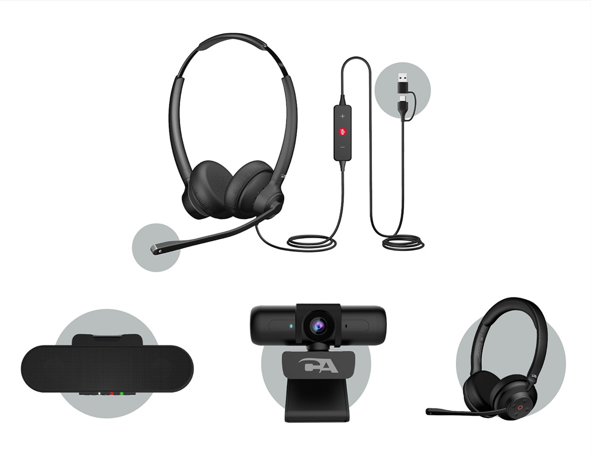
Reusable shape, color, and product-image treatments gave ecommerce, web, and sales assets a shared visual structure.

Logo rules extended the system into apparel, business cards, and other sales-facing touchpoints.

Brochures, banners, and sales leave-behinds used the same visual logic across product lines and event contexts.

Social templates translated the brand system into flexible campaign assets across square, vertical, and horizontal formats for product, education, and B2B messaging.

Presentation samples show how the system scales into company overviews, product storytelling, and partner-facing sales decks.