Website Experience Design System
Strengthening Cyber Acoustics’ Web Presence
I redesigned core Cyber Acoustics website touchpoints to make product information clearer, the brand experience more consistent, and the site easier for internal teams to maintain. My work spanned homepage updates, solutions pages, product page templates, navigation improvements, and interactive product storytelling within Squarespace.
ROLES
Art Direction, UI/UX Design, Web Design
TEAM
Content Strategy & Review, Technical Product Lead, Technical Support Specialist
TOOLS
Squarespace, Figma, Google Trends, SemRush
GOALS
Clearer product information, More consistent page layouts, Easier navigation, Reusable templates

Overview
The Main Informational Touchpoint for Cyber Acoustics
The Cyber Acoustics website is the main informational touchpoint for every audience the brand serves: direct consumers, partners, resellers, and IT procurement.
My work created a stronger website foundation through clearer product storytelling, more consistent page structures, updated imagery, and a design direction that better reflected Cyber Acoustics’ product quality and market position.

Updated website touchpoints showing the broader redesign system across product pages, solutions content, navigation, and brand presentation.
Redesign Direction
From Audit to Redesign Direction
I started with an audit of the existing site, then developed color and layout direction options to present to the CEO and COO.

I audited the existing site to identify gaps in product information, hierarchy, navigation, and brand consistency before developing redesign directions for leadership review.

Competitive website references used to evaluate product navigation, brand presentation, visual hierarchy, and market positioning before developing redesign directions.
I presented four color palettes applied to a revised layout, drawing from competitive benchmarks leadership wanted the brand to move closer to.

Four different color palette applications applied to a layout I created, revising the headsets page on the Cyber Acoustics website.
Once color and layout treatment were locked in, we started redesigning the website page by page, beginning with the site footer.


The footer was one of the first areas updated after the redesign direction was approved, helping establish a more modern visual tone for the rest of the site. Note: original in white (top), updated footer in black (bottom).
Constraints
Platform Constraints
The site was built in Squarespace, which limited control over global styling, responsive behavior, and custom interaction patterns. To keep the redesign consistent within those limits, I created reusable image assets, page structures, and Figma working frames that helped the team build within Squarespace’s block-based system.

Example of how I adapted my design process around Squarespace’s Fluid Engine, using in-platform layout testing and Figma refinements to create assets that scaled more predictably.
Product Page Template
Building a Repeatable Product Page System
I redesigned the Cyber Acoustics product page structure into a reusable template, improving the visual system, clarifying the information hierarchy, and standardizing copy, punctuation, and layout patterns across pages.
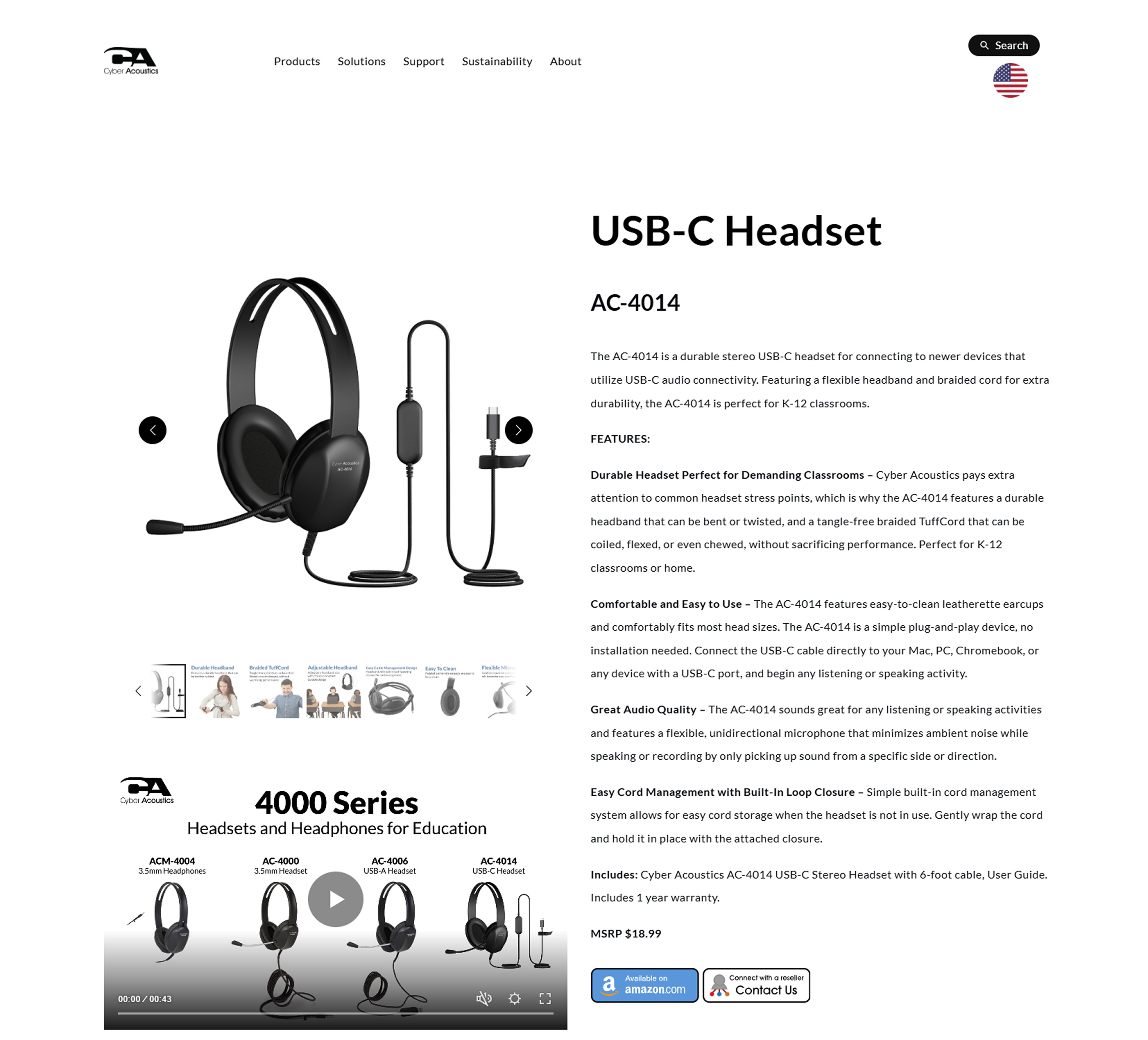

Unclear hierarchy, wall of text, price and buttons buried under product attributes, and lacking visual brand treatment.

Product page competitive research: visual tone and brand messaging, less text that goes a longer way, entry-points into different areas of the customer journey.
I redesigned the product page around a clearer hierarchy, scannability, and decision support. Long product attributes and specifications were moved into accordions to reduce visual clutter, while updated typographic treatment, button styles, image treatment, and section breaks helped separate key information across the page.
I also added areas for alternate products, videos, compatibility details, and sustainability messaging, giving users more context without overloading the core product experience.

Revised product page hero with clearer hierarchy, updated button styles, a cleaner image carousel, and accordions for detailed product information.

Benefit highlights and alternate product recommendations helped users scan key features and compare similar options within the same product category.

Product video and specifications were separated into clearer sections, helping users access technical details without overloading the main product overview.

Compatibility and sustainability sections added more product context while connecting the page to Cyber Acoustics’ education and recycling initiatives.
I created documentation alongside the redesign so that team members could build new product pages independently. This documentation included a checklist covering copy, SEO, and general page optimization.

A portion of the product page checklist created to help team members build, QA, and maintain new product pages consistently across copy, SEO, specifications, links, and layout.

Reusable product image template with consistent sizing, replaceable image placeholders, and built-in guidance to help teammates create product page visuals more consistently.
Key Improvements
Solutions Pages
I designed 10 pages to communicate the value of the product line across Cyber Acoustics' key markets: Education, BPO, Healthcare, Office, Government, and Commercial.
Each page needed to translate product features into market-specific value, helping different audiences quickly understand which Cyber Acoustics products fit their environment.

Agent Assist Solution page, presenting the user with a product line overview as well as two pathways to learning about the Agent Assist Solution.


How the Agent Assist Solution works and Why Upgrade to the Agent Assist Solution.
Megamenu Redesign
I updated the existing site navigation from a clickable text menu to an image-based megamenu. The intention behind moving to a more visual system was to give users enough context to self-select their navigation route faster.

Solutions page examples of the megamenu.

Product megamenu
Homepage
I focused on using the homepage to communicate immediately who Cyber Acoustics serves and what they value, leading with the three key solutions: Education, BPO, and Office. The homepage needed to speak to a wide variety of visitors while keeping the narrative unified.


Short introductions to the different solutions.
Noise Cancellation Widget
I refined the design, improved usability, and added more storytelling to the experience of the Noise Cancellation Widget. Handoff included annotations on behavior, state changes, and scaling.

Before

After

Handoff documentation for our website developer. I worked closely (in office) with him to help translate these designs into a working prototype.
Outcomes
A Stronger Foundation for Future Site Updates
My work established a stronger visual foundation across Cyber Acoustics’ key website touchpoints and created repeatable systems the team could continue using after handoff. While the broader redesign was still ongoing, the completed updates improved consistency, navigation, and maintainability across the areas I touched.

Reusable product page frames used to scale the image system across additional headset pages, supporting more consistent product visuals after handoff.
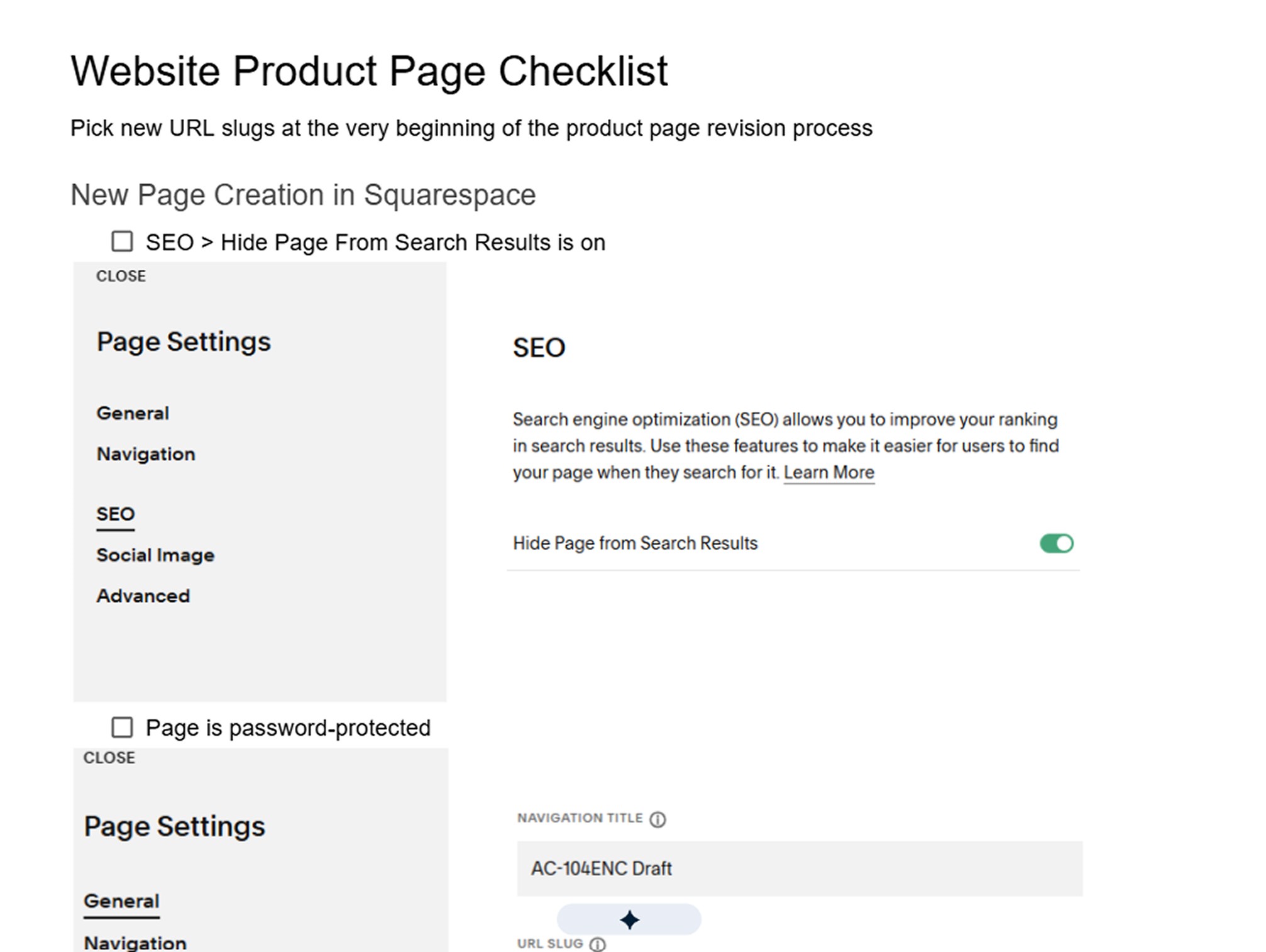
Product page checklist created to standardize page setup, copy, SEO, specs, links, and QA for future product pages.

Current product pages showing the functional template system still in use, with later styling updates to elements like button shape.

Implemented product page system.